目次
はじめに
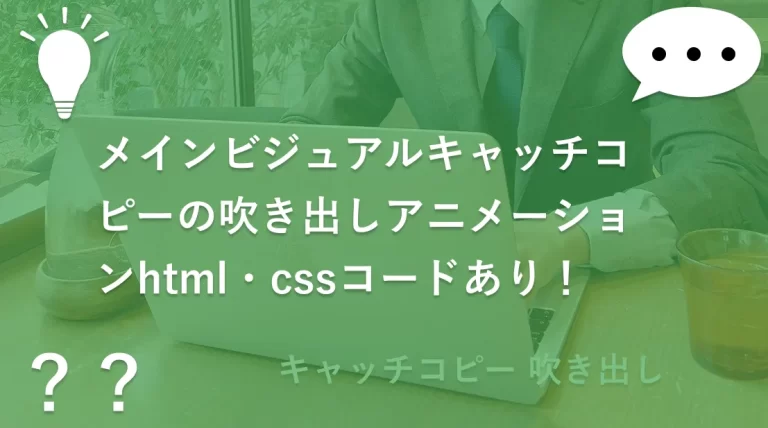
今回は実務案件でご依頼いただいたメインビジュアルキャッチコピーの吹き出しアニメーションをご紹介します。
スマホで見た場合は「アニメーションが終わった後に消してほしい」というご要望でした。なのでPC用とスマホ用でアニメーションの挙動が変わっています。
以下の「メインビジュアルキャッチコピーの吹き出しアニメーション動き」の部分でページを再読み込みしていただいて動きを確認してください。
メインビジュアルキャッチコピーの吹き出しアニメーション動き
ここでページを再読み込みしてください。
キャッチコピー○○○○
キャッチコピー○○○○
キャッチコピー○○○○
メインビジュアルキャッチコピーの吹き出しアニメーションソースコード
PR
<div class="mv">
	<div class="mv__content">
		<div class="balloon">
			<div class="loading1 text-red">
				キャッチコピー○○○○
			</div>
			<div class="loading2">
				キャッチコピー○○○○
			</div>
			<div class="loading3">
				キャッチコピー○○○○
			</div>
		</div>
	</div>
	<div class="mv__img">
		<img src="https://kk-works.koukoba.net/wp-content/uploads/2023/10/person-dummy.webp" alt="社長などの写真" width="400" height="400">
	</div>
</div>
.mv {
position: relative;
display: flex;
align-items: flex-end;
gap: 5%;
}
.loading1,
.loading2,
.loading3 {
text-align: center;
font-weight: 700;
margin: 0 auto;
animation: extend 1.2s 1s cubic-bezier(0.215, 0.61, 0.355, 1) forwards;
opacity: 0;
transform-origin: left;
line-height: 1;
}
.text-red {
color: #e61e0b;
}
.balloon {
width: 90%;
background-color: #fff;
opacity: 0;
animation: balloon 4s 0.5s ease-in forwards;
}
.balloon::before,
.balloon::after {
content: "";
position: absolute;
}
@keyframes extend {
0% {
transform: rotateY(90deg);
opacity: 0;
}
100% {
transform: rotateX(0deg);
opacity: 1;
}
}
@media only screen and (min-width: 768px) {
.mv {
padding: 0 0 0 6.5%;
}
.mv__img img {
width: 33vw;
}
.loading1 {
font-size: 2.7vw;
margin-bottom: 1.67vw;
}
.loading2 {
font-size: 2.2vw;
margin-bottom: 1.25vw;
animation-delay: 1.4s;
}
.loading3 {
font-size: 2.2vw;
animation-delay: 1.7s;
}
.balloon {
position: relative;
margin: 2.5vw 6.67vw 2.5vw auto;
padding: 2.5vw 0;
border-radius: 2vw;
border: 0.25vw solid #7f7f7f;
}
.balloon::before {
left: 100%;
top: 1.1vw;
border-left: 8.33vw solid #7f7f7f;
border-bottom: 4.17vw solid transparent;
}
.balloon::after {
left: 98%;
top: 1.3vw;
border-left: 8.33vw solid #fff;
border-bottom: 4.17vw solid transparent;
}
@keyframes balloon {
0% {
transform: rotateX(90deg);
opacity: 0;
}
10%,100% {
transform: rotateX(0deg);
opacity: 1;
}
}
}
@media only screen and (max-width: 767px) {
.balloon {
position: absolute;
bottom: -40vw;
padding: 5vw 0;
z-index: 10000;
border-radius: 10px;
border: 2px solid #7f7f7f;
}
.balloon::before {
bottom: 100%;
left: 90px;
border-bottom: 30px solid #7f7f7f;
border-left: 40px solid transparent;
}
.balloon::after {
bottom: calc(100% - 5px);
left: 87.5px;
border-bottom: 30px solid #fff;
border-left: 40px solid transparent;
}
@keyframes balloon {
0% {
transform: rotateX(90deg);
opacity: 0;
}
10%,90% {
transform: rotateX(0deg);
opacity: 1;
}
100% {
transform: rotateX(90deg);
opacity: 0;
}
}
.loading1 {
font-size: 5.4vw;
margin-bottom: 1.67vw;
}
.loading2 {
font-size: 4.5vw;
margin-bottom: 1.25vw;
animation-delay: 1.4s;
}
.loading3 {
font-size: 4.5vw;
animation-delay: 1.7s;
}
}環境によってデザインが崩れないかは変わってくるので、フォントサイズやマージンの調整は必要に応じて行なってください。
他のHTML・CSS ・JavaScriptソースコード紹介記事まとめ
ソースコードまとめ
実務経験で作成したレイアウトのHTML・CSS ・JavaScriptソースコードを紹介した記事まとめています。